
En 2020 hay muchos desarrolladores y diseñadores que quieren aprender los conceptos básicos de CSS. En esta serie de artículos, te enseñaré esos temas principales. En este artículo específico, revisaré las propiedades CSS esenciales de la tipografía mientras uso muchos ejemplos visuales.
Antes de comenzar, asegúrese de unirse a nuestra nueva comunidad en CssClass.com para artículos CSS, código abierto y más.


font-family
This
font-family property is used to declare what font we want to use. It can receive an array of fonts. This can be useful to us for two reasons:- If the first font isn’t working in a specific operating system, the browser will use the next font until something matches it.
- If the font has missed some of the characters, it will fill in the missing characters from the next font at the list.
font-family: Arial, Helvetica, sans-serif;


font-weight
This property, like his name, is for declaring the
font-weight of the text. The default value of this property is normal, and the second common value of it is bold.In more advanced fonts there are more than two states. Instead of using names in the values, these fonts are using numeric values:
100 / 200 / 300 / 400 / 500 / 600 / 700 / 800 / 900 and 950. Which are equal to the common mapping names (in design apps), see table:

The
normal keyword is equal to 400 value, and the bold keyword is equal to 700 value. Examples:/* Keyword values */
font-weight: normal;
font-weight: bold;/* Numeric keyword values */
font-weight: 100;
font-weight: 200;
font-weight: 300;
font-weight: 400;// = normal
font-weight: 500;
font-weight: 600;
font-weight: 700;// = bold
font-weight: 800;
font-weight: 900;


font-size
This property, like his name, is for declaring the
font-size of the text. Even today, the most common sizing unit is pixels. Example:font-size: 16px;


From my perspective, it is better to control the
font-size with rem units. If you want to know more about how to work with rem units, you can read my article “Update your font-size to REM units”.
line-height
This property is telling the browser the height of the line in ratio to the
text-size. This property can get fixed value like pixel, but the most common way is to give it a value of ratio without any unit.The
line-height property, is a type of inherited property, which usually means you declare it one time in the root element, and it will affect all the elements on our website. This way if we have different font-size in inner elements, the line-height will stay with the same ratio, and we won’t need to declare it multiple times. Example:body{
font-size: 15px;
line-height: 1.4; // 15px * 1.4 = 21px
}.inner-class{
font-size: 30px;
// 30px(font-size) * 1.4(line-height) = 42px (total line-height)
}


font-style
We use it to update the text font into an italic variant state.
font-style: italic;


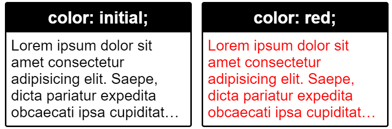
Text color property
The
color property is used to color the text. It can receive color keywords, for example, red, magenta. It can receive a HEX color code and color functions like RGB and HSL. If you want to know more about CSS colors, you can read my article “Why CSS HSL Colors are Better!”./*** the color red in diffrent writing methods ***/
/* Keyword syntax */
color: red;/* Hexadecimal syntax */
color: #ff0000;
color: #ff0000ff; /*last two characters for alpha*/
color: #f00;
color: #f00f; /*last character for alpha*//* RGB Function syntax */
color: rgb(255, 0, 0);
color: rgb(255, 0, 0, 1); /*last value for alpha*//* HSL Function syntax */
color: hsl(0, 100%, 50%);
color: hsl(0, 100%, 50%, 1); *last value for alpha*/

text-align
This property, like his name, is to control the alignment of text in its reading axis(inline-axis). Besides the possibilities to align
left and right, we have the center value and the less known justify value, which aligns the text in both ways.text-align: left;
text-align: right;
text-align: center;
text-align: justify;


Besides, there is an extensive property,
text-align-last, which allows you to differentiate the last line from all the other lines. For more info: text-align-last in MDN.
direction
The
direction property sets the direction of text, table columns, flexbox, grids, and more. It has two values:ltrvalue – for Latin languages that are read from left to right.rtlvalue – for Semitic languages that are read from right to left.
When using the
direction property the text-align property is being updated automatically as well in the same direction unless it is defined otherwise. Example:body{
direction: rtl; /* update text-align value to right; */ direction: ltr; /* update text-align value to left; */
}


vertical-align
This property is used mainly for vertical inline text content. The main common values are
baseline (default value), text-top, and text-bottom which are relative to the line-height of the text in the container.There are more values like
top and bottom that can act differently only if the line-height of to row is different from the line-height of the inline elements.This property can be used even unit values which are positioned according to the
baseline value, which means 0px = baseline, with this, you can play with negative & positive values, for example -2px or 2px .Examples:
vertical-align: baseline; // default
vertical-align: text-top;
vertical-align: text-bottom;
vertical-align: top;
vertical-align: bottom;
vertical-align: middle;vertical-align: -4px;


Note: this vertical alignment is good for text elements. For vertical alignment of boxes, it is better to use CSS flexbox.
text-decoration
This property’s most used case is for adding
underline to links, and it could also be used for creating overline and line-through. Example:

But in the last years, this property has been given a lot of extensions, and now you can use all the values together, for example:
text-decoration: underline overline line-through;


Another possibility we now have is to play with the style of the lines and with their color.
text-decoration: underline dashed;
text-decoration: underline dotted;
text-decoration: underline blue;
text-decoration: underline green;


text-transform
The
text-transform property specifies how to capitalize on texts. We use it to make text appear in all-uppercase or all-lowercase, or to make each word capitalized.text-transform: none; // default
text-transform: lowercase;
text-transform: uppercase;
text-transform: capitalize;


letter-spacing
The
letter-spacing property, as his name is, decreases or increases the spacing between the letters of the words. When using this property with px units, you can use fragments of pixels for example 0.1px. To decrease the spacing, this property can get negative values as well, like -1.5px, for example.letter-spacing: normal; // default value
letter-spacing: 3px;
letter-spacing: -1.5px;
letter-spacing: -0.1rem;


word-spacing
The
letter-spacing property, as his name, allows us to define the space between the words.word-spacing: normal; //default value
word-spacing: 20px;


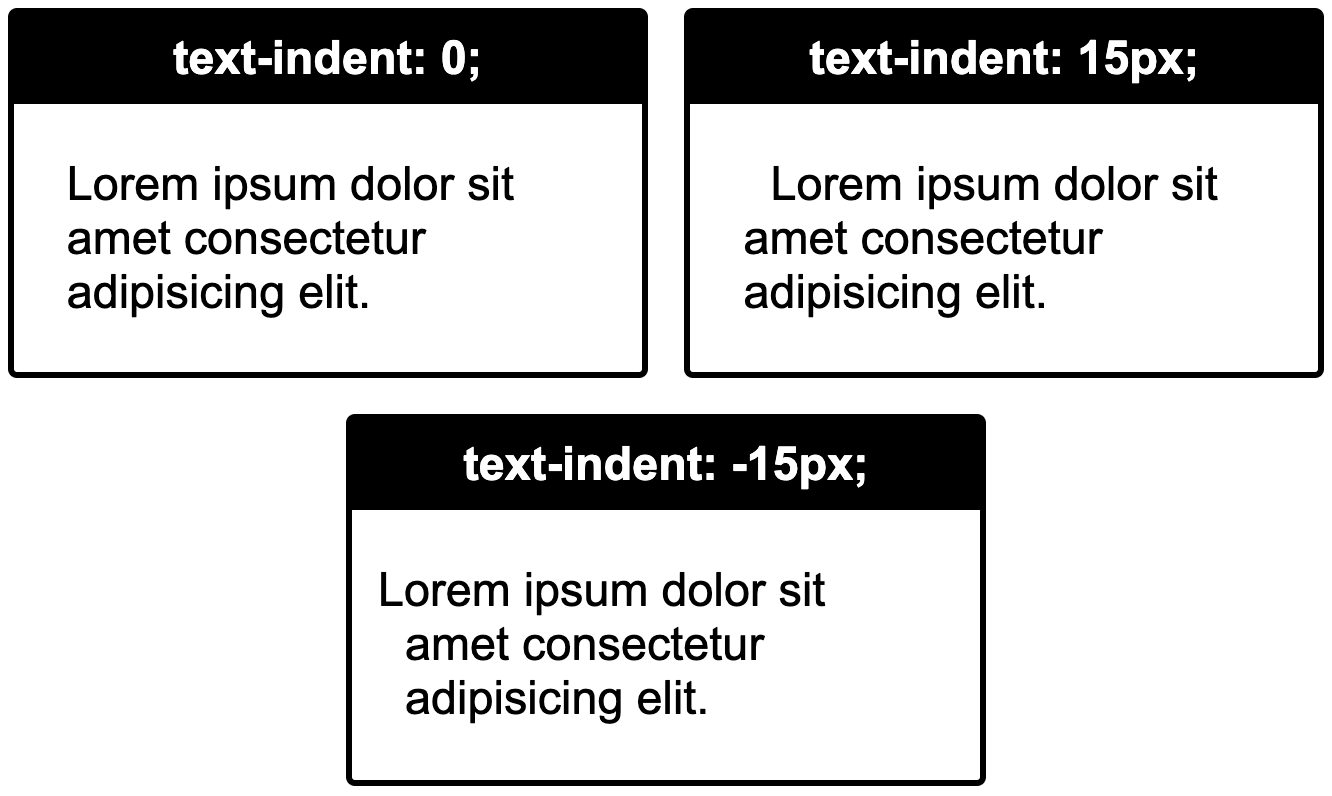
text-indent
The
indent property is used to indent the first line in a paragraph. Inside with a positive value or outside with a negative value.text-indent: 0; // default value
text-indent: 15px;
text-indent: -15px;

::first-letter
The
::first-letter pseudo-element selector allows us to style the first letter in different styles from the regular text in paragraphs, for example.p{
font-size: 26px;
}p::first-letter{
font-size: 50px;
}


Besides the
::first-letter pseudo-element, there is the ::first-line pseudo-element, which allows you to style the first-line of a paragraph differently. Because I haven’t seen a common use for it, I have decided not to give it a big stage in my article, but just to notify you that it exists.
text-shadow
The
text-shadow property allows us to add shadow to text. For it to work, we need to provide it with at least the offset-x and the offset-y of the shadow. If we provide only these two values, the shadow will be left without a spread and with the same color of the text.The third numeric value will be the spread of the shadow. We can also give it a different color value, in the beginning, or the end of the value.
Besides, we can add multiple text-shadows, using a comma in the value.
text-shadow: 5px 10px;     // offset-x | offset-y
text-shadow: 5px 10px 5px; // offset-x | offset-y | blur-radius// offset-x | offset-y | blur-radius |color
text-shadow: 5px 10px 5px red;
       /* equal to */
text-shadow: red 5px 10px 5px;// multiple text-shadow
text-shadow: 5px 10px 5px green,
             10px 15px 5px red;


text-stroke
The
text-stroke property is a non-standard property that works in all main browsers. It works with the -webkit prefix, even on Firefox & old Edge. The property receives two values, stroke-width and stroke-color./* Short writing */
-webkit-text-stroke: 2px purple;/* or Full writing*/-webkit-text-stroke-width: 2px;
-webkit-text-stroke-color: purple;


More and More and More!
There are more properties of CSS for typography and big new topics like Variable Fonts, which are dynamic. But in this article, I have tried to show the main basic elements to control typography with CSS.
If this topic interests you, you can continue and explore this vast topic in CSS. Here some more properties and topics we haven’t talked about: Variable Fonts,
font-variant, text-justify, unicode-bidi, all the ways of breaking words in CSS, and I may have missed several more🙂.To Summarize
In this article, my primary purpose was to show the most useful properties for CSS typography and to provide you with this knowledge.
Final Words
I hope I inspired you and showed you some new possibilities.
If you like this post, I would appreciate applause and sharing 🙂.
If you like this post, I would appreciate applause and sharing 🙂.
Also, you can see all of my content on my website: eladsc.com.